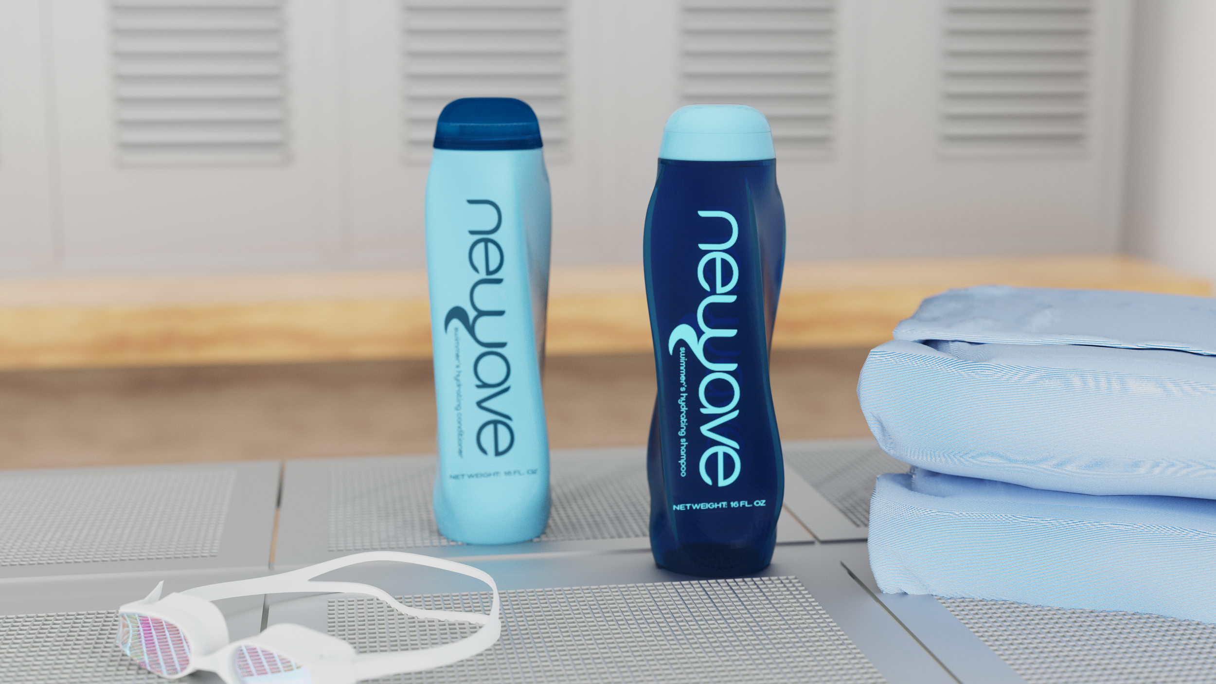

Newave
Newave is a haircare brand designed for professional swimmers to combat the dehydrating effects of chlorine and fit into the competitive water sport lifestyle This was later revisited to expand upon the brand & product line.
Year
2021
Timeline
Brand & Bottle Development | 8 weeks
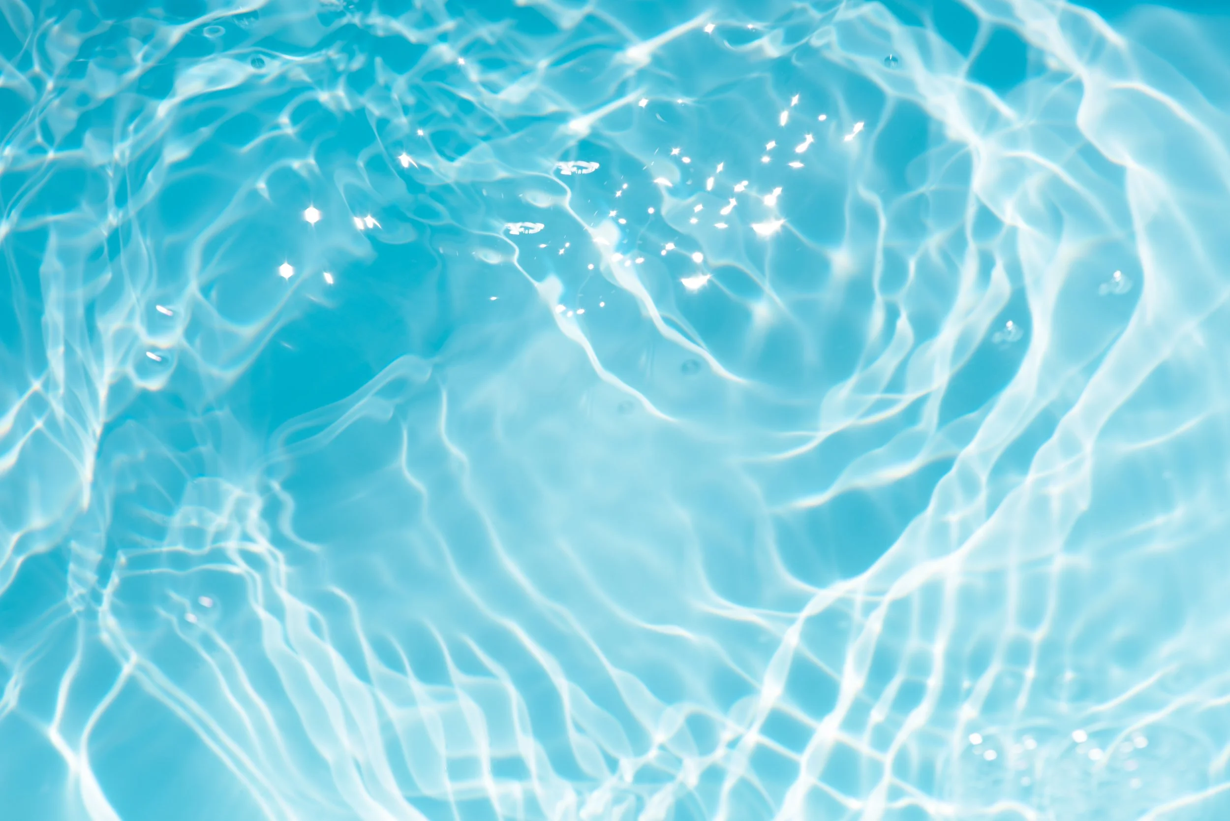
Inspired by Water
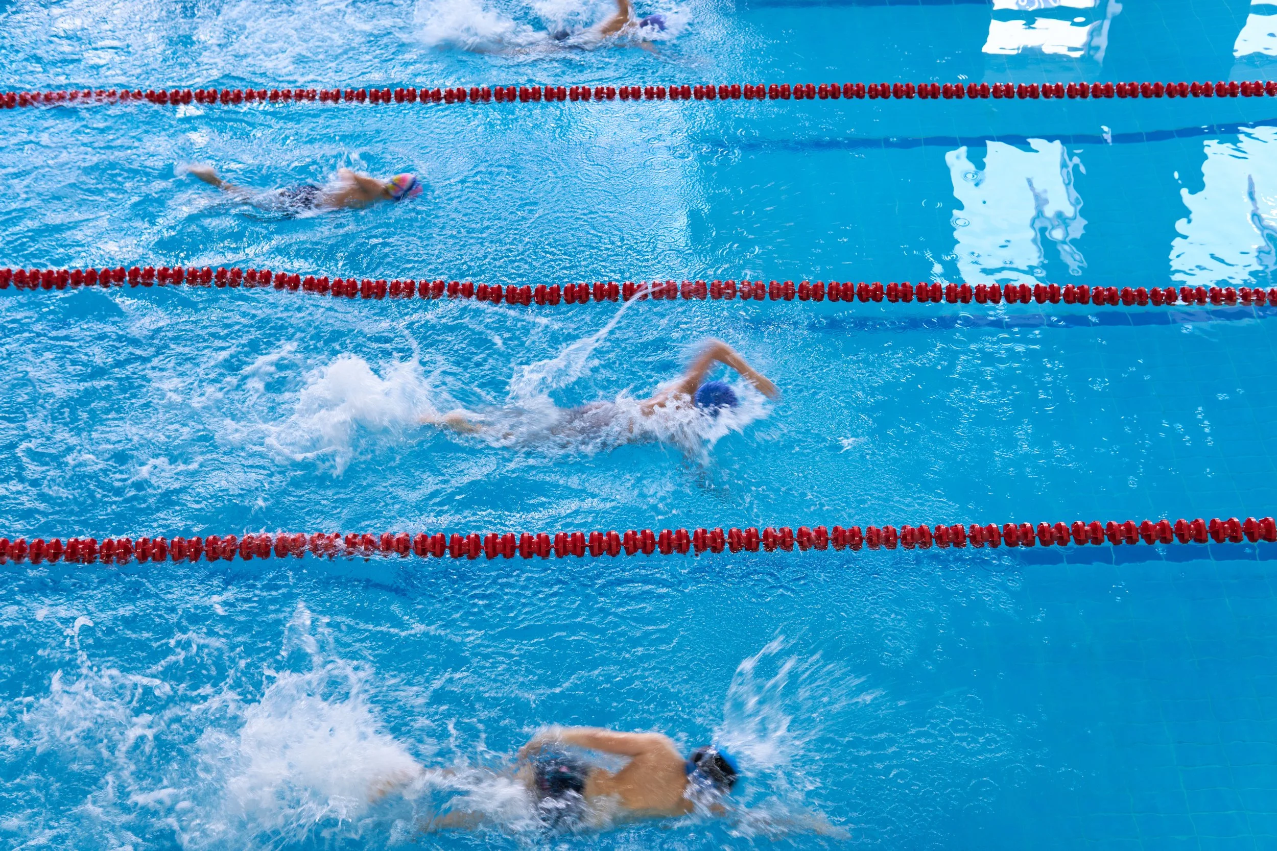
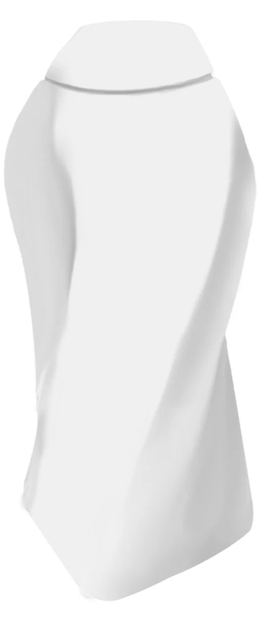
Laminar flow is a phenomenon that occurs when water moves smoothly, without irregular fluctuations. This gives the illusion of water looking solid, like glass, when in reality, it’s still flowing. This illusion inspired the form of newave due to its similarity to competitive swimming. When streamlining underwater, the water’s surface appears undisturbed, while in reality, the swimmer is surging onward to catch the competition.
Newave Design Goals
Create packaging that can be easily transported in a gym bag without spilling or being very heavy.
Develop a brand identity that expresses the love of competition, teamwork, and water that competitive aquatic athletes embody.
Bottles should be able to be manufactured using blow molding.

Ideation
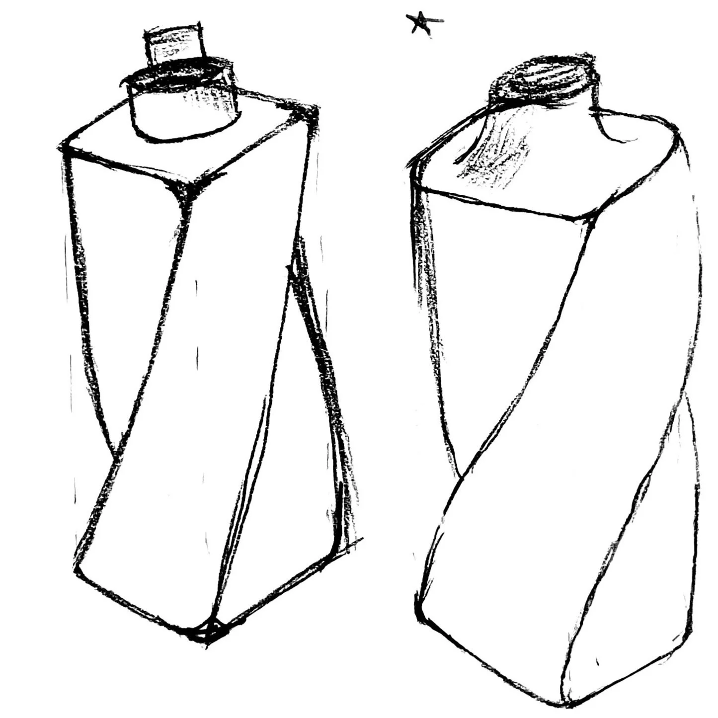
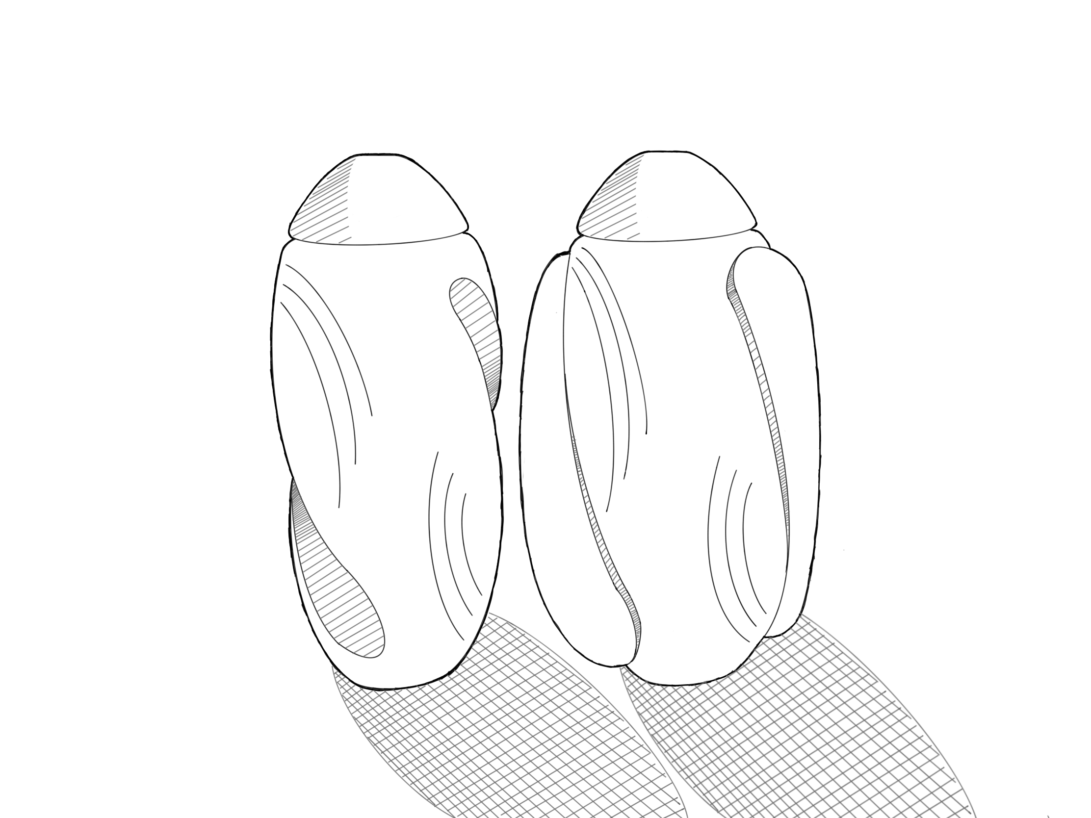
Although this form was one of the first I developed, it quickly identified itself as the most successful, showing the smooth consistency of laminar flow while being quite simple.
Although this form was one of the first I developed, it quickly became a favorite, showing the smooth consistency of laminar flow.
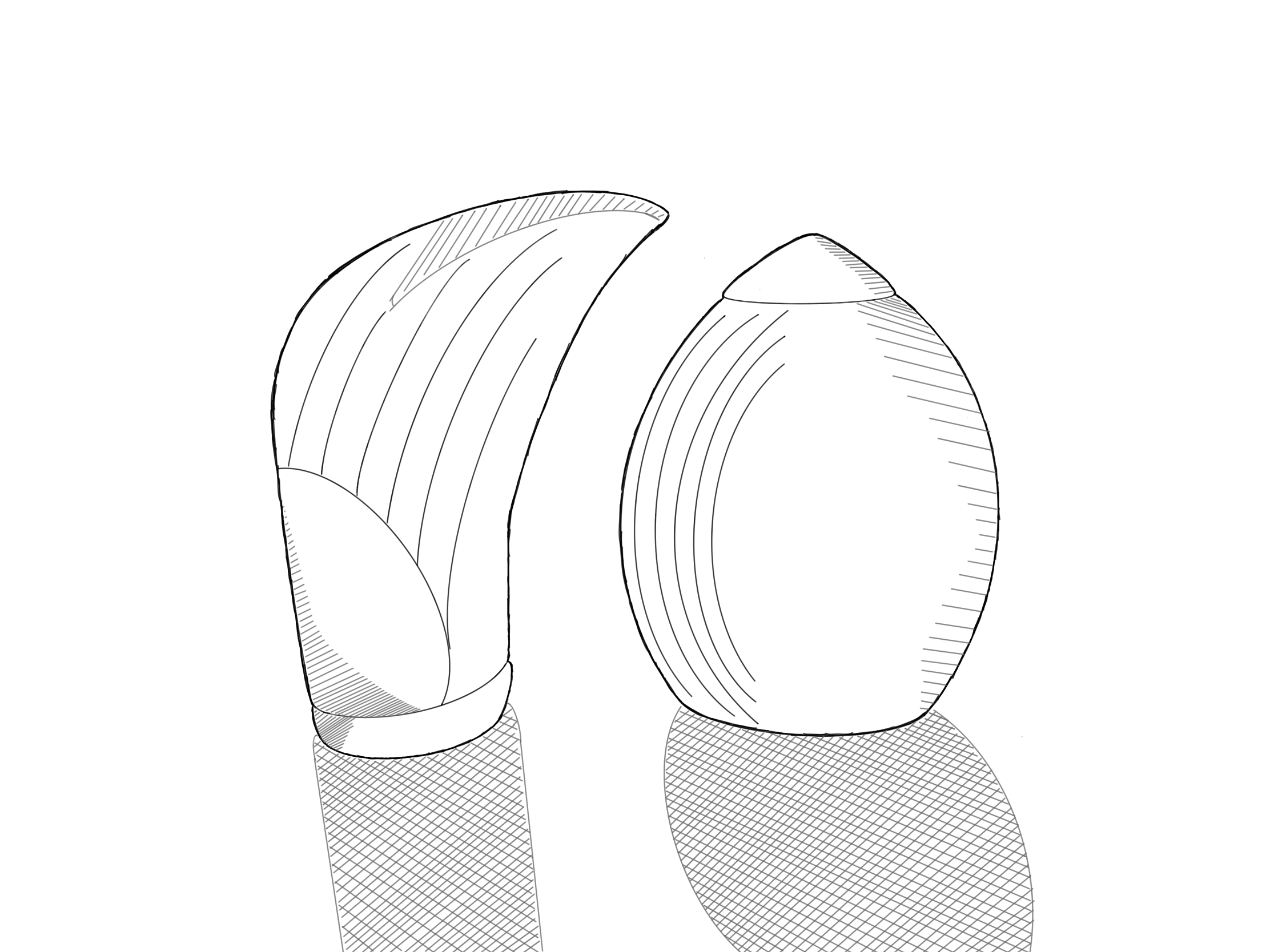
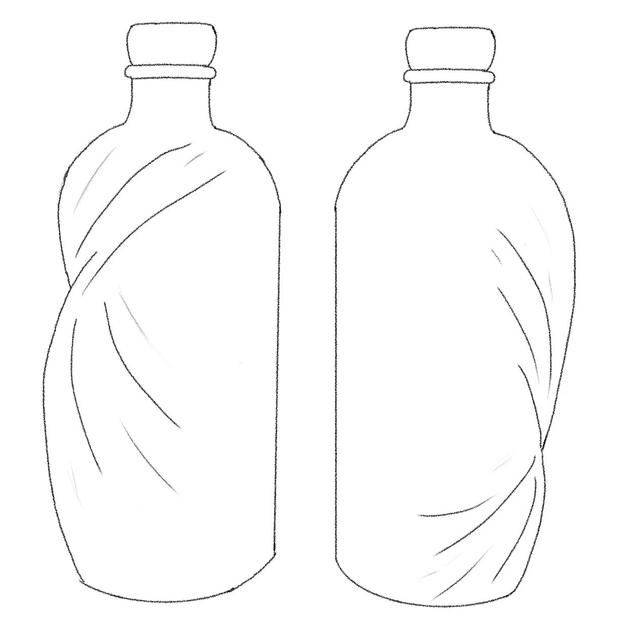
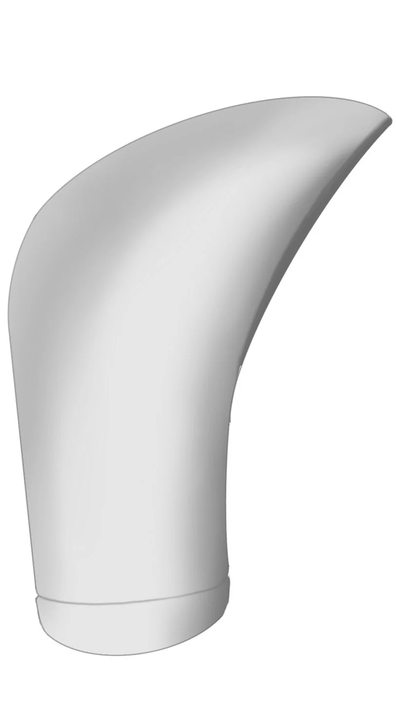
I liked the duality of these wave and droplet inspired bottles, but they felt a little too high end for the competitive swim demographic.
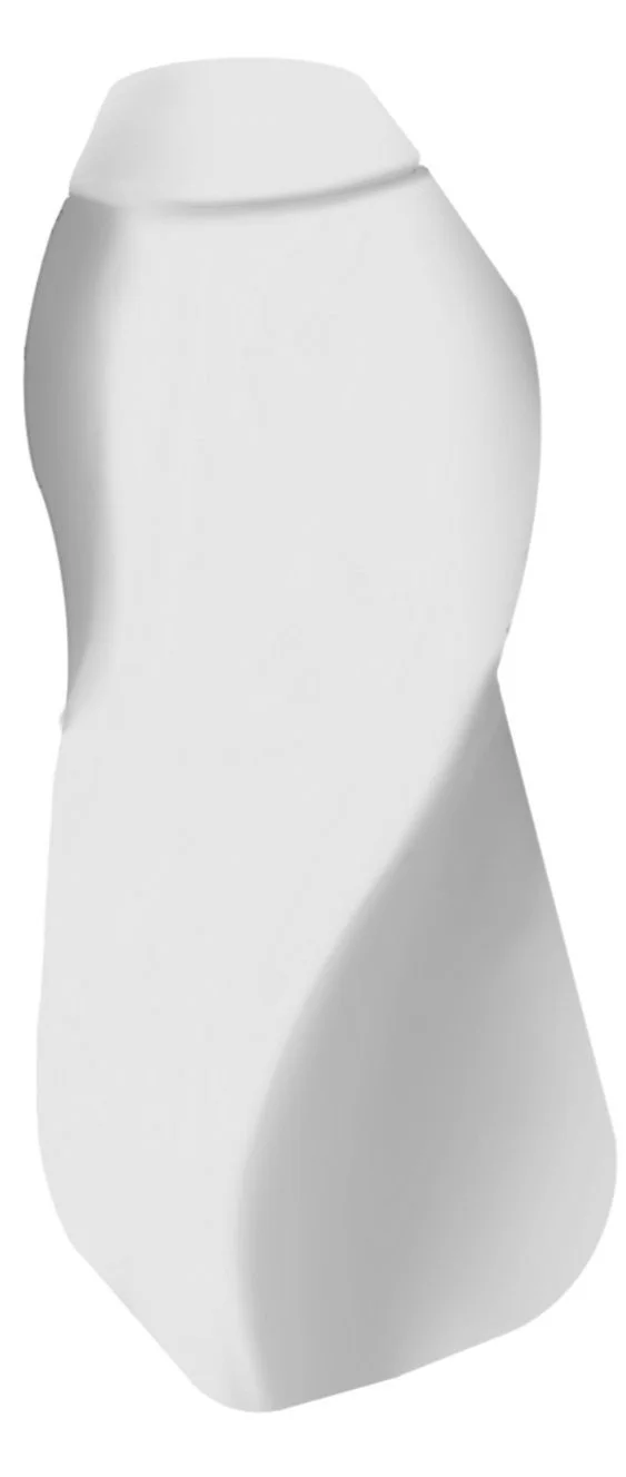
The wave and droplet form evolved into less high-end, more abstracted bottle designs, while the other two designs remained more similar to their initial iterations.
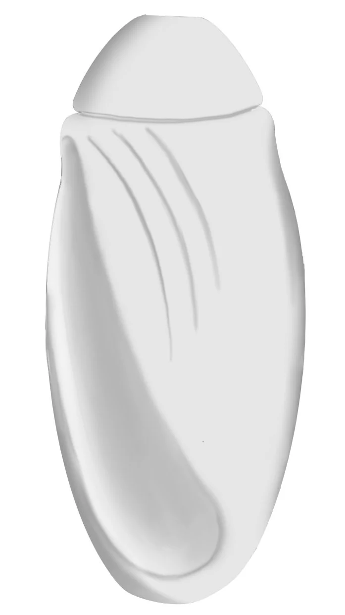

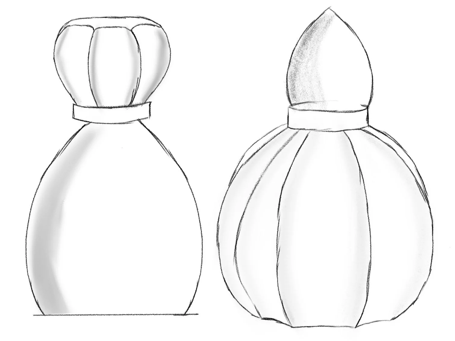
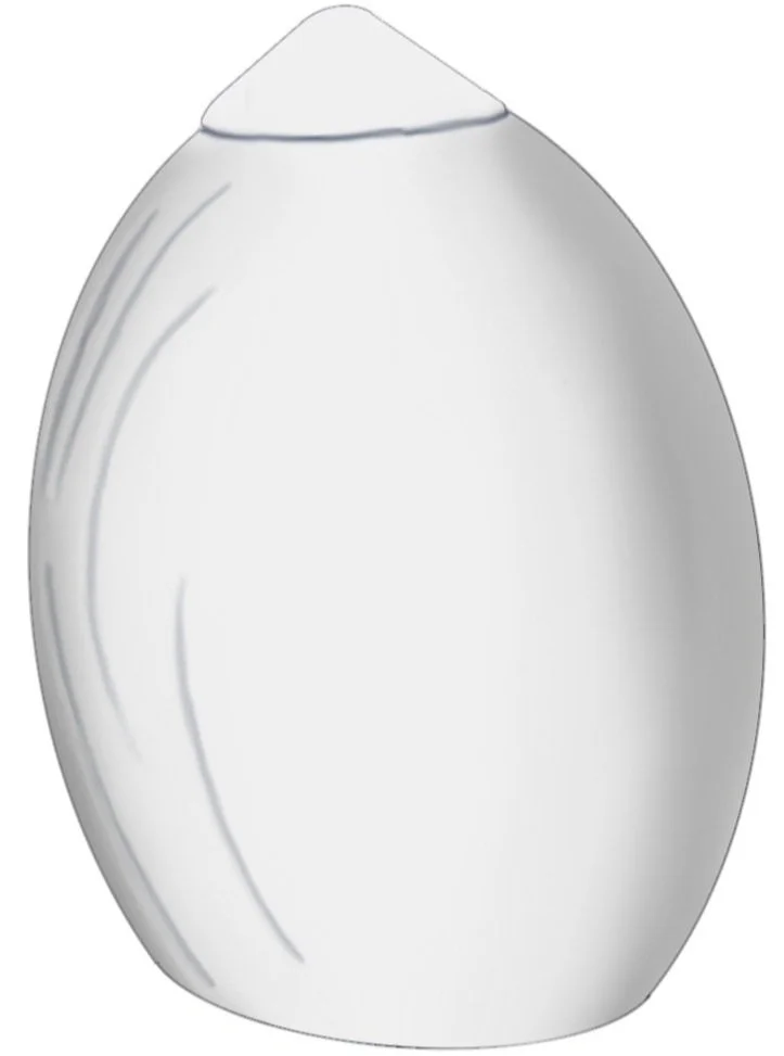
Emulating the crest and trough of a wave, these bottles were a favorite due to their elegance, and the form distinction between conditioner and shampoo bottle.
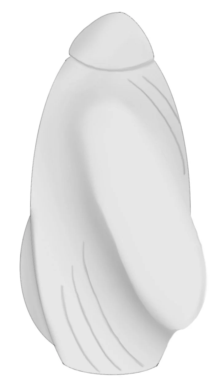
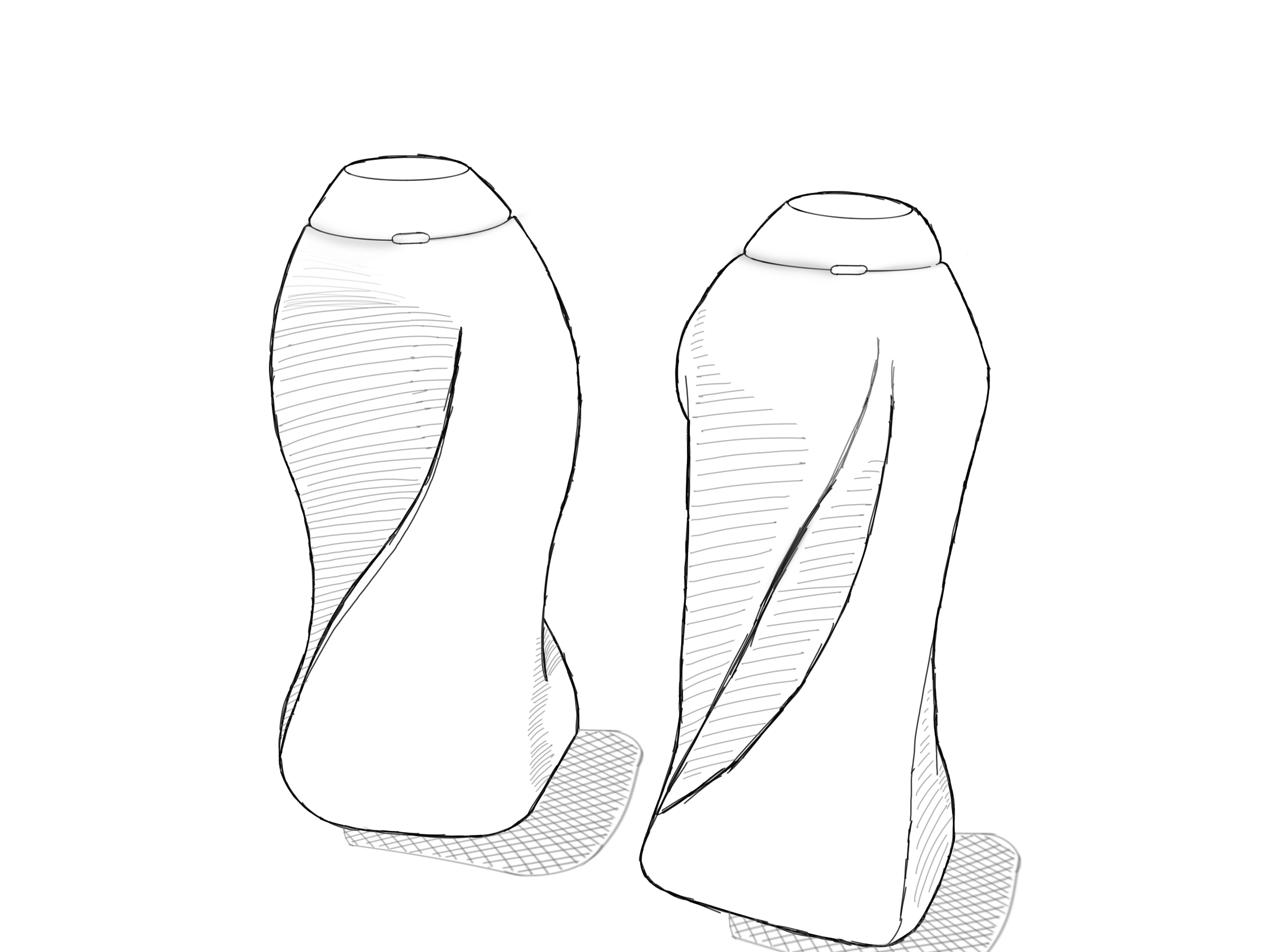
Doing simple greyscale hand renders, I discovered the most successful option was the curved cylindrical design, as not only did it match the desired brand language, but allowed the bottles to nestle together during shipping and when in a competitor’s swim bag.
Creating the Brand

After developing the brand name, the wave element of the logo mark came quite quickly. In early iterations, I included splashing droplets around the logo mark, and used a very simple sans serif to start out. Eventually, I rounded the edges of the typeface to create a more aerodynamic look, as well as abstracted the wave symbol to communicate competition and speed over playfulness.